Art Deco Poster Design.
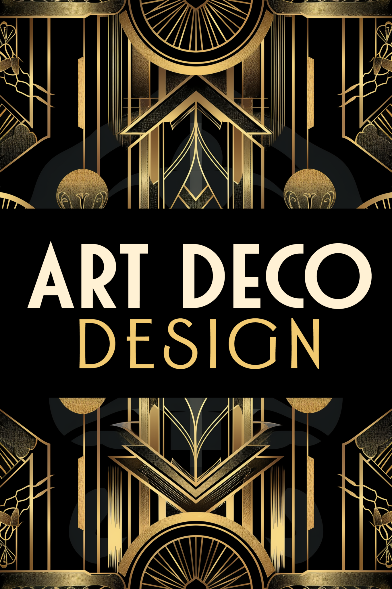
Here you can see the classic black and gold with decorations and lines very very elegant.
While it is nice, the brief that we had for this did not call for this particular classic style.
Instead we made a departure with color and art. And let’s get into that.
First we have the illustration of the town where the exposition is held. We then recolored it to match the brand colors and did a little bit of redrawing as well.
The font choice was Letterhead Fonts Matthews Modern and Letterhead Fonts Gloria bold. Both of them are fantastic compliments to one another. Check out the hundreds of hand-crafted typefaces at letterheadfonts.com plus their Art Deco Style fonts.
We also used Letterhead Fonts Speak Easy extras. Speak Easy extras is a bunch of decorative panels by letterhead fonts. There is no doubt that these fantastic Art Deco panels. Check them out sometime.
In the first mockup we kept it minimalist based on the brief and the look and feel that was asked then we dropped it into a mockup poster mockup. It was fun exercise to stretch and morph this classic style into something familiar but different but also meeting client approval.
We believe it turned out well. This design maintained the elegant style of Art Deco yet being different from what you usually see.
Understanding an art “style” like Art Deco and then massaging it to fit the customer’s vision is important. You have to do your research on art styles. Even if you have done it in the past and know quite a bit. Go study it anyway because you may discover an idea or a concept by someone you have not yet heard from. Great Graphic Design includes being great at research. Research your client needs and what is important to them so you can know how to provide the best value for them.
Feel free to reach out if you have an idea or project. We will be happy to help.

