How to convey emotions with type. Different type faces can invoke different emotions, let’s explore how we can do it..
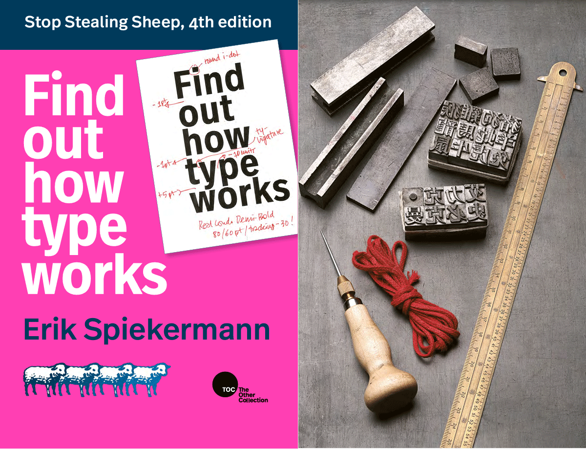
Let’s talk some more about typography. I mentioned the book Stop Stealing Sheep and Find Out How Type Works.
Let’s dive into some ideas, for example, how to convey emotions using type. Let’s choose anger which was mentioned in the book. What are its characteristics? It’s heavy, it bears down on you, and it needs room to shout or expand. For anger, letters don’t have to be perfect—they can be irregular.
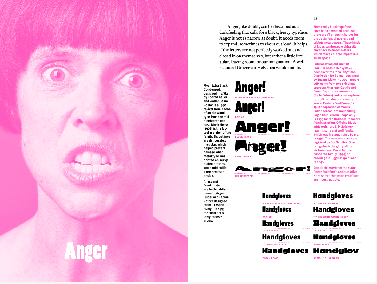
We have some examples above: Flyer Extra Black Condensed, Poplar Black, and Heavy. Those two aren’t really that readable, but you kind of get the idea.
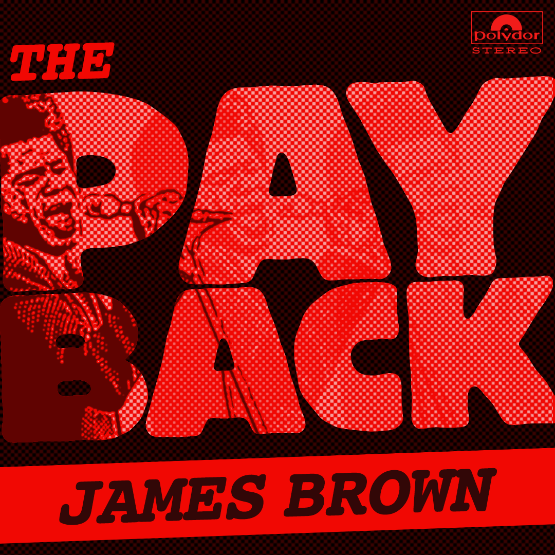
Taking what we learned about emotion and type from the book examples, here’s one concept (shown above). In the song “The Payback,” James Brown sings about being mad, wanting revenge, and getting back at someone who did him wrong. For this, I used Block Heavy. I think this typeface captures the tone of the song, and the graphic elements hit all the right boxes for the time period.
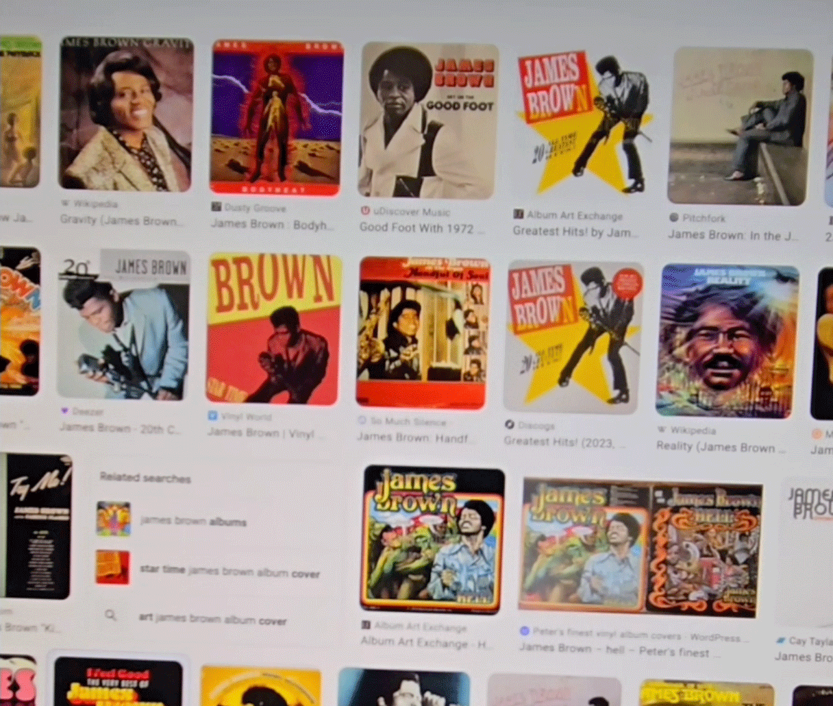
After some research, I found big, bold type paired with photos of James Brown, mostly in black and white or half-tone. He’s not looking at the camera, and there are boxes or panels that are big, bold, and simple that grab attention. I think the approach that we came up with really hits the mark in conveying the emotion of anger. What do you think? Do the fonts in the book represent anger in the way you expect? Do you have ideas of your own?
Want to find the right fonts, images and graphics to attach to and represent your brand?
Feel free to reach out any time so we can bounce around some ideas together.

